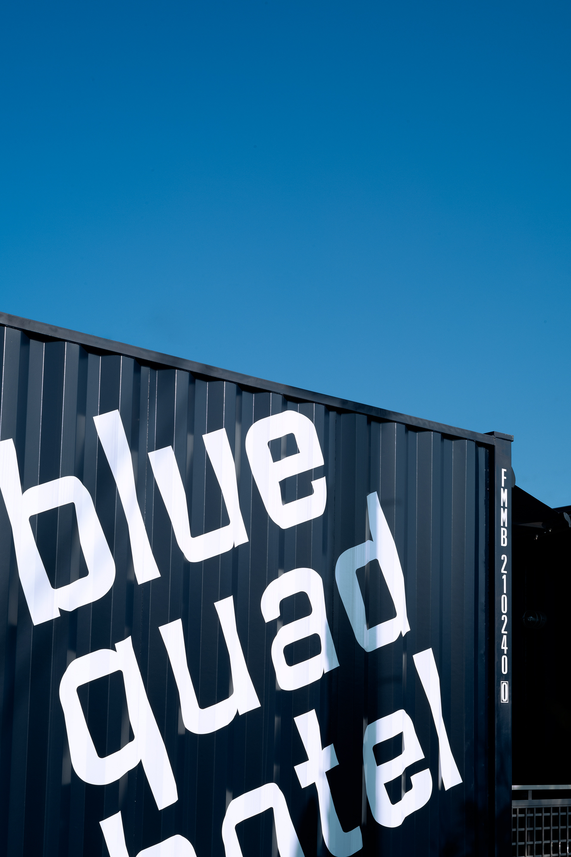
blue quad hotel
Naming / Brand Identity / Typeface / Wayfinding
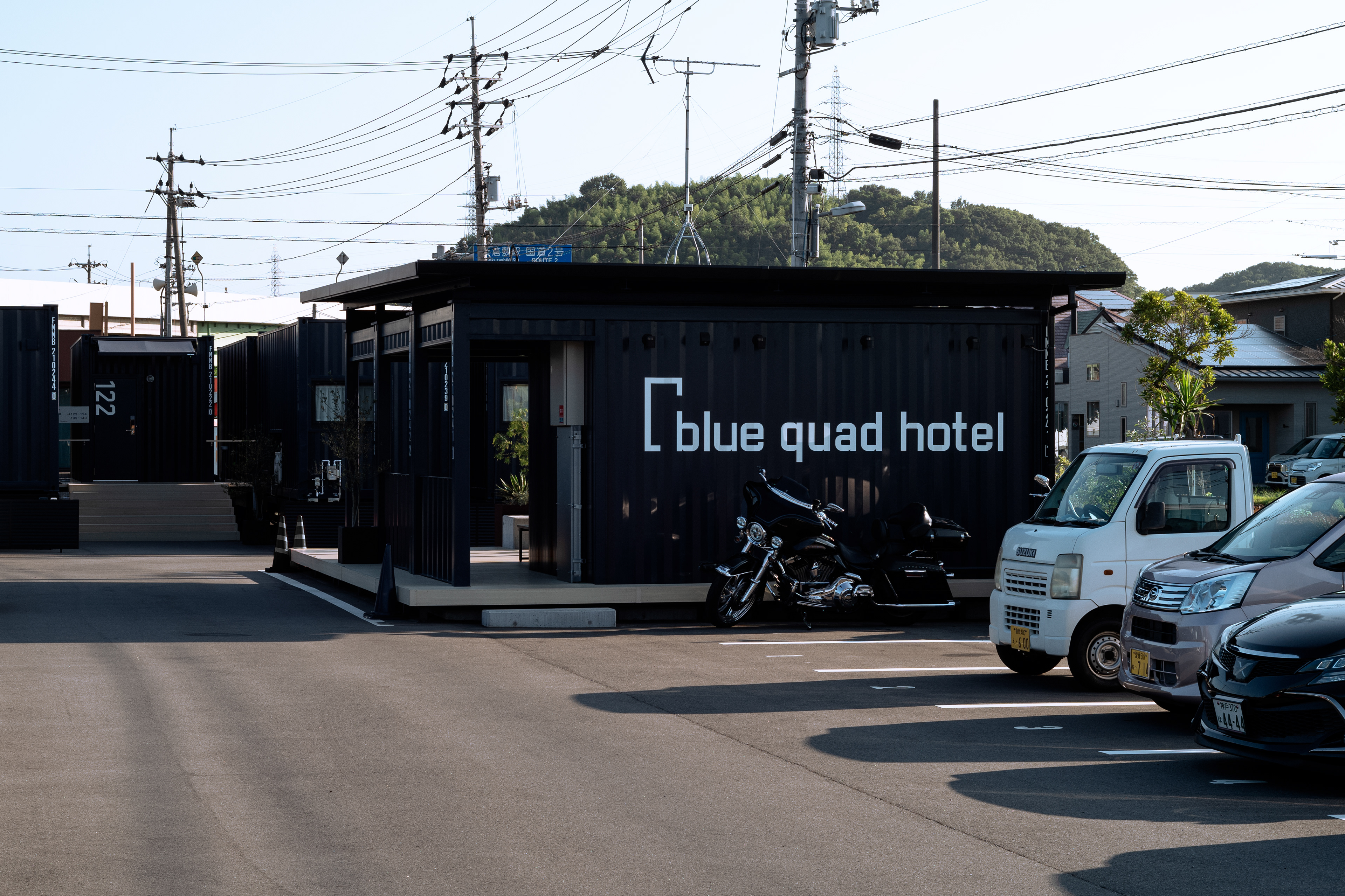
We designed naming, brand identity, and signage design for a new hotel "blue quad hotel" in Kurashiki, Okayama.
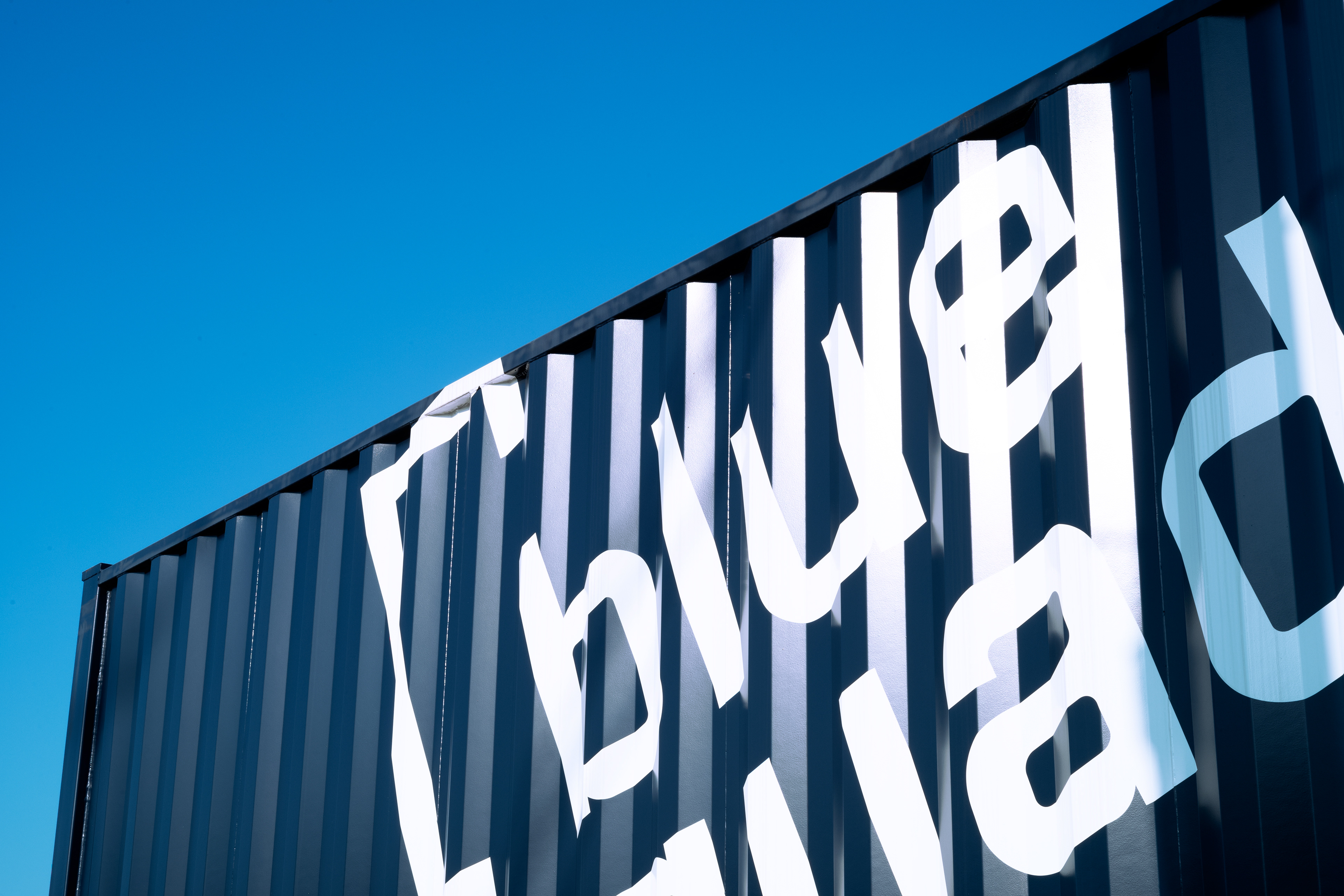
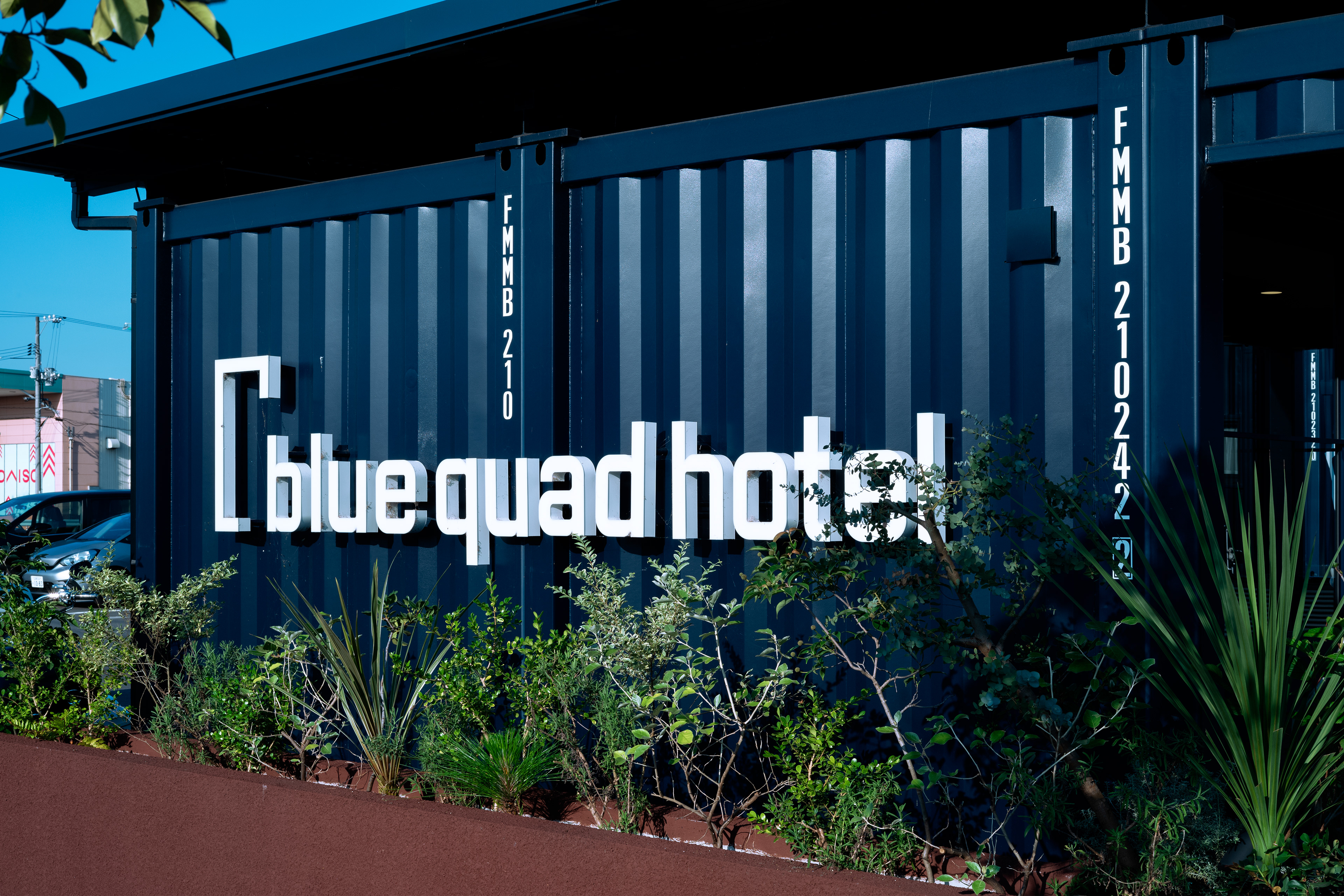
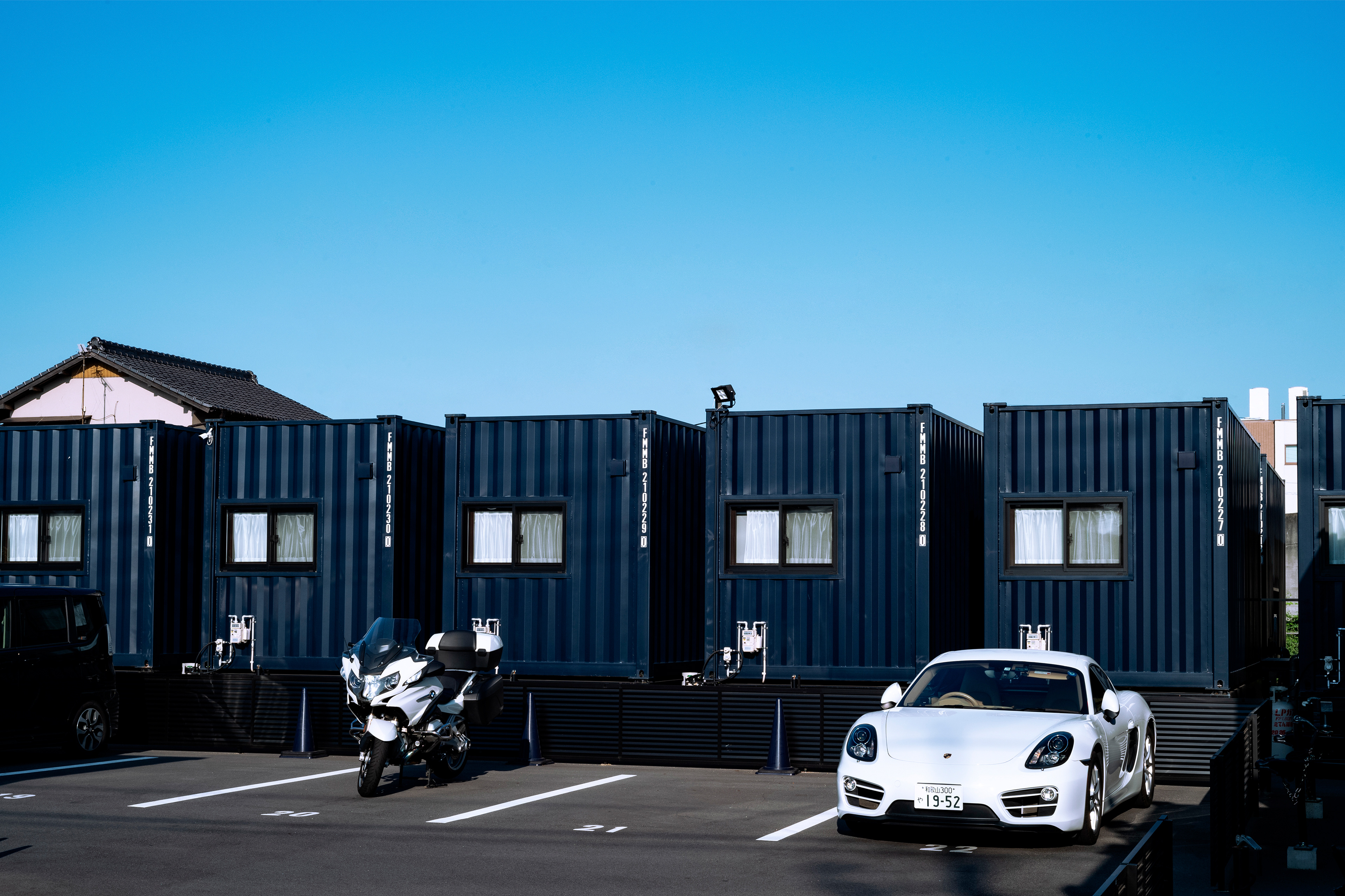
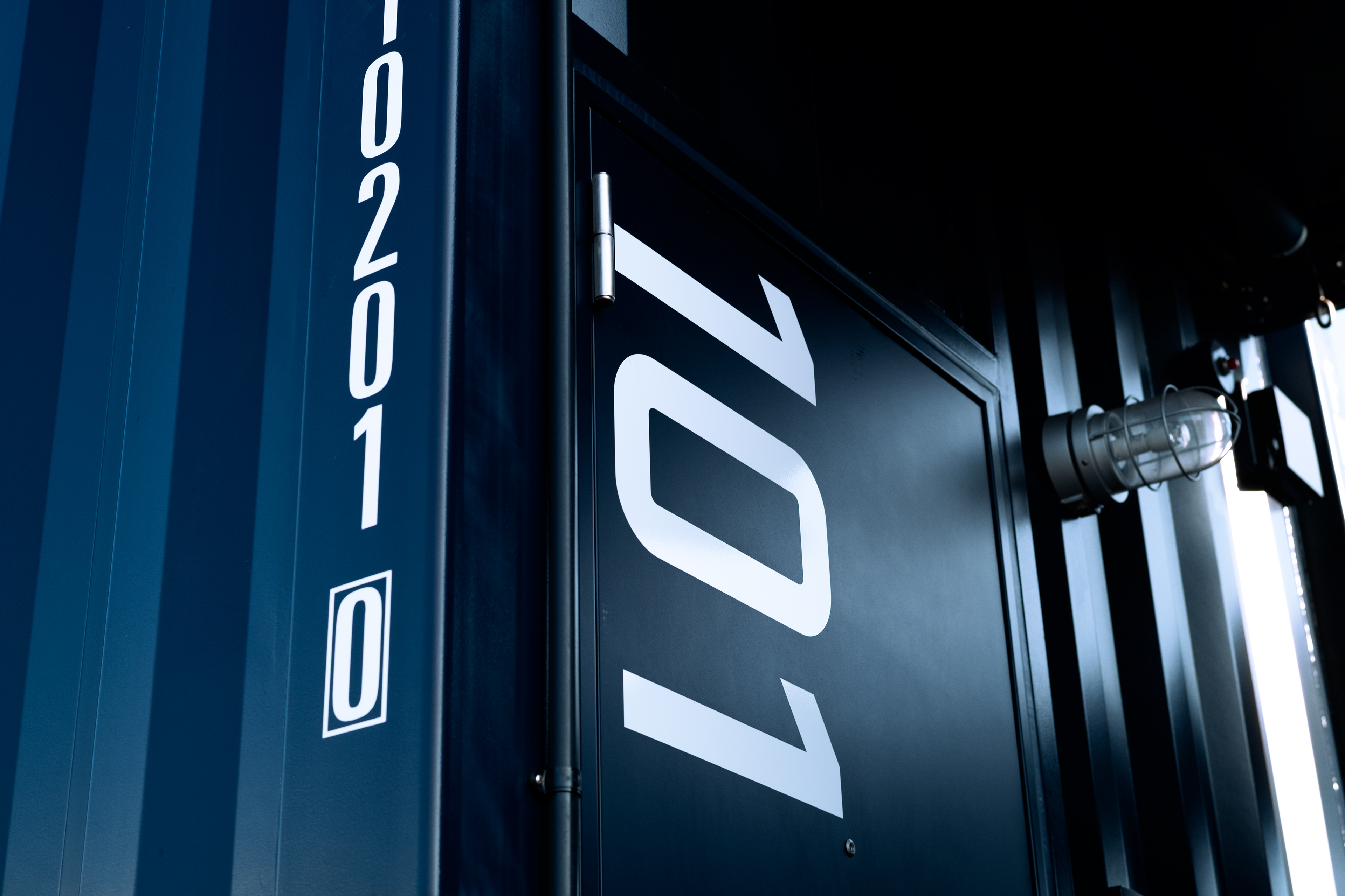
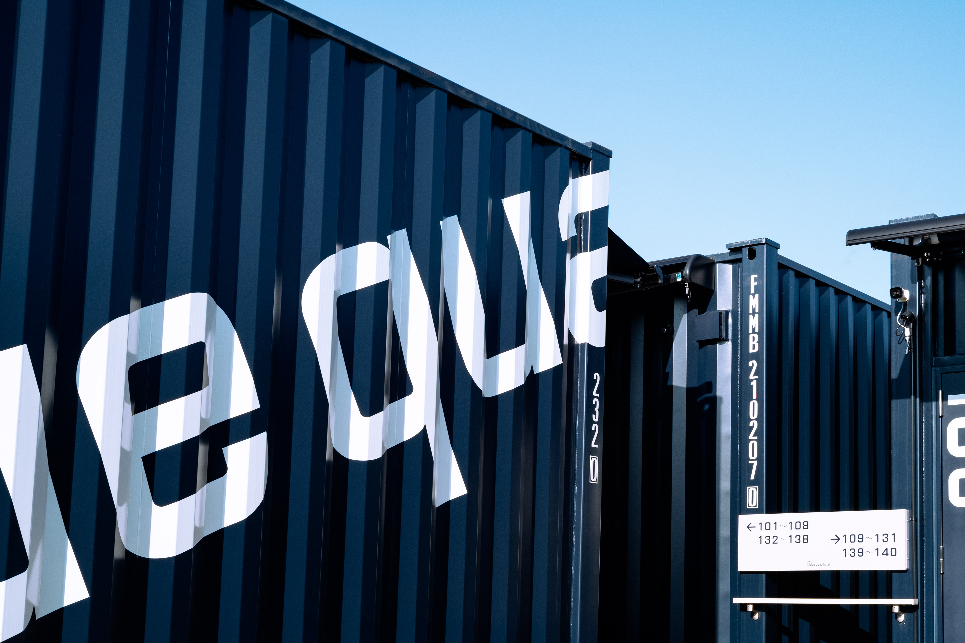
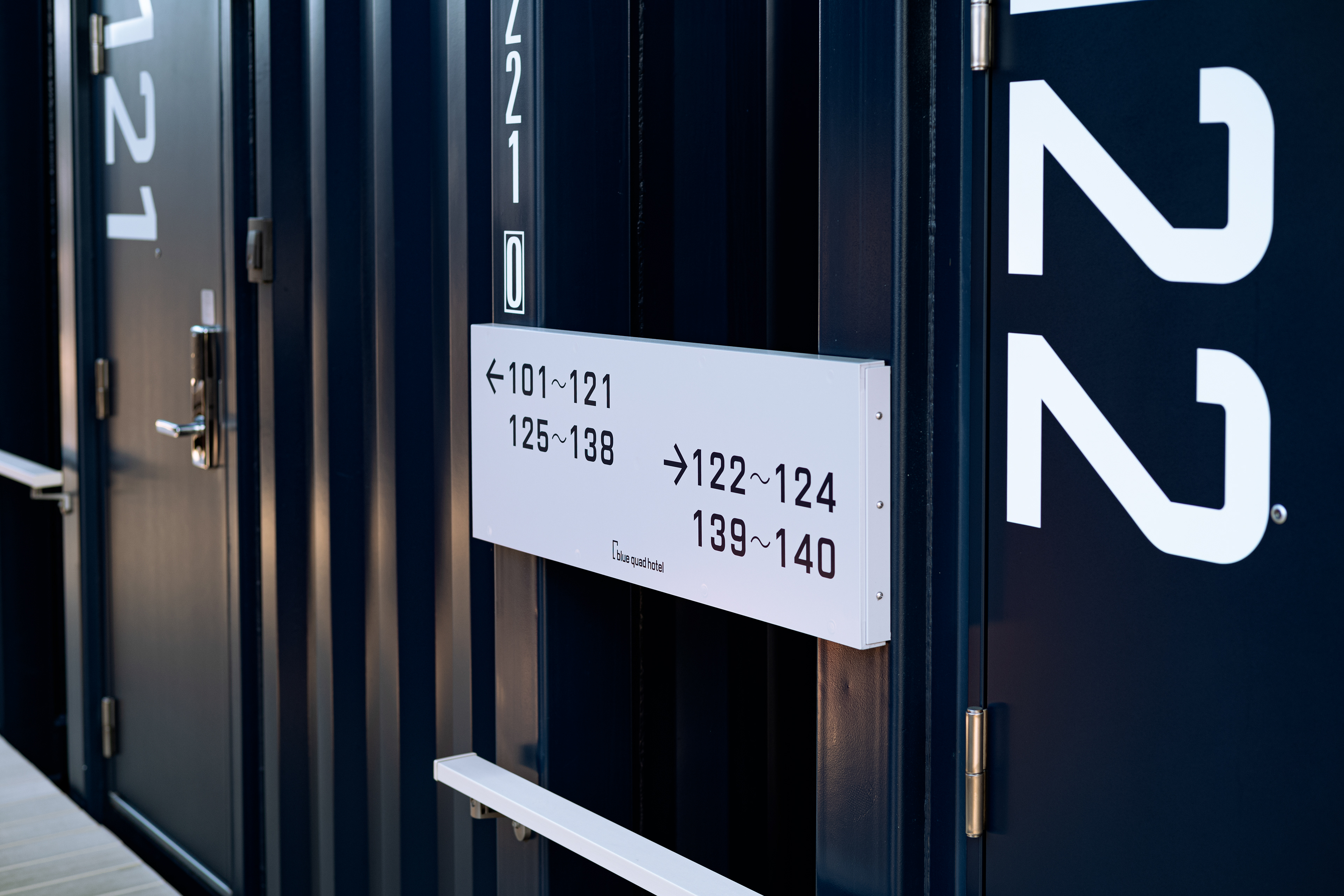
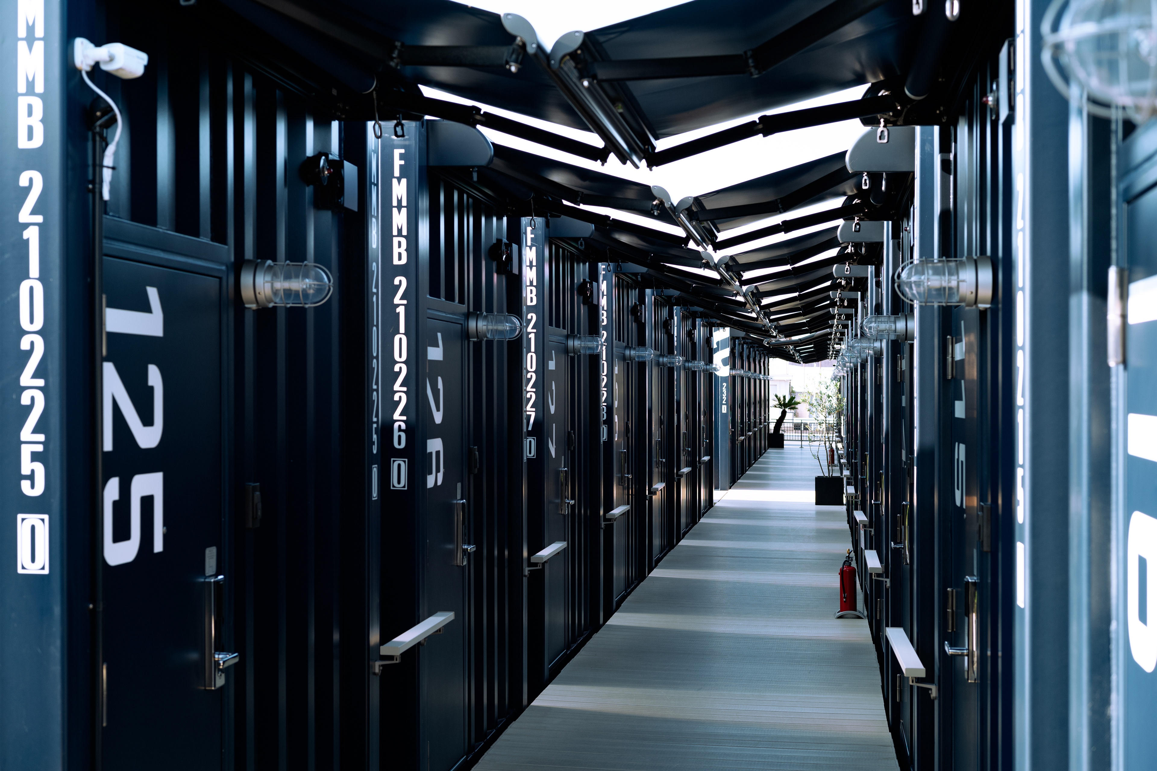
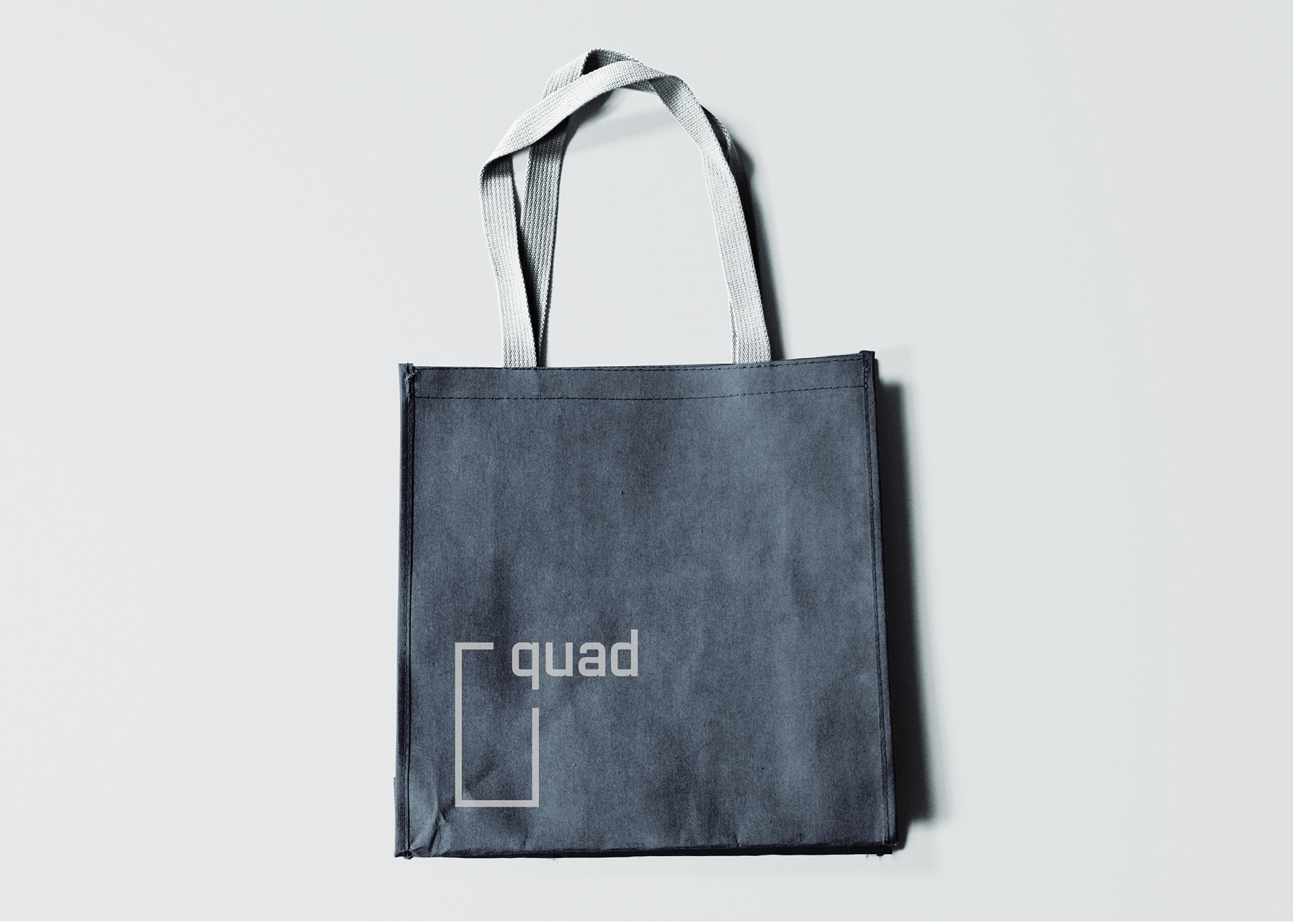
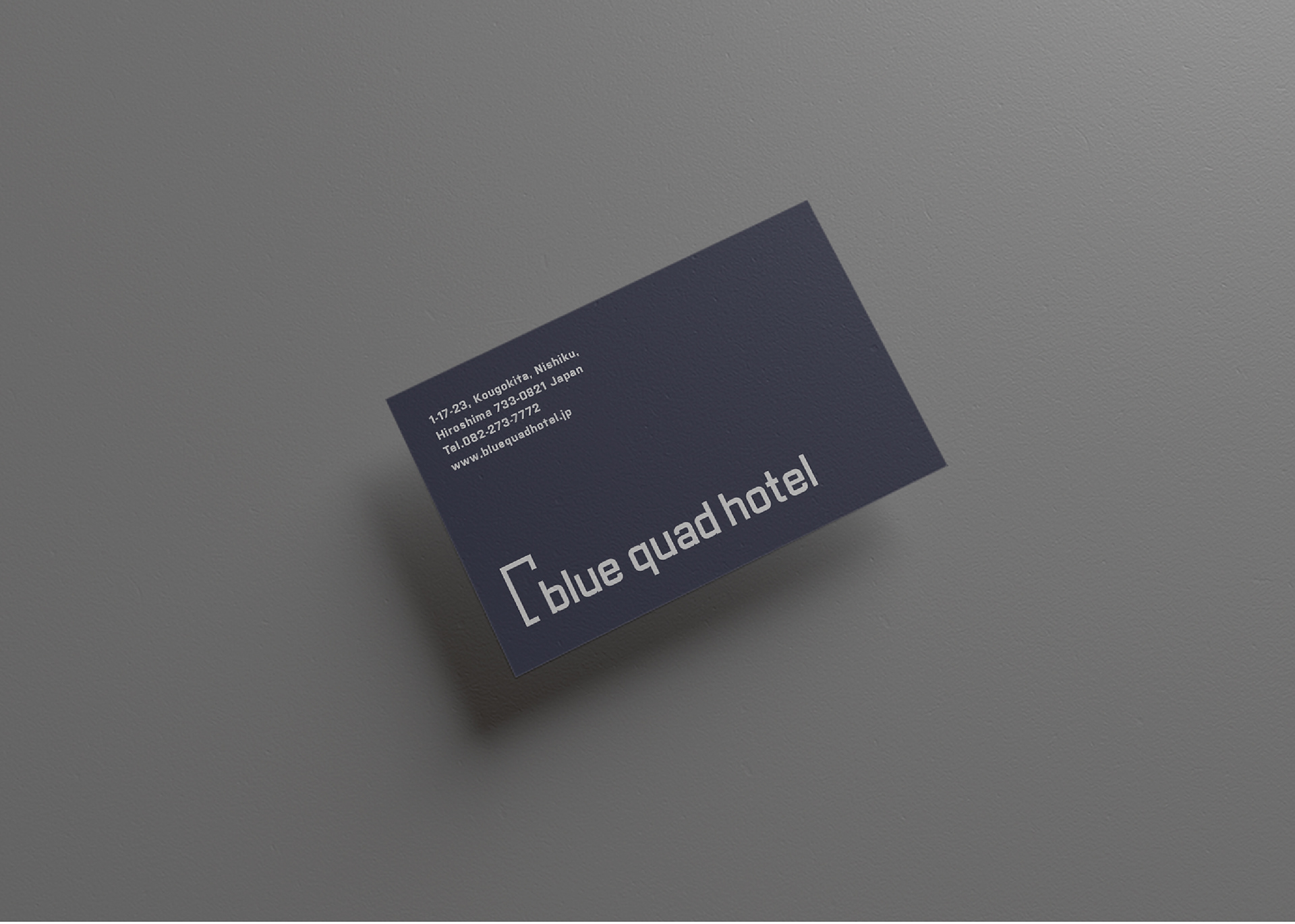
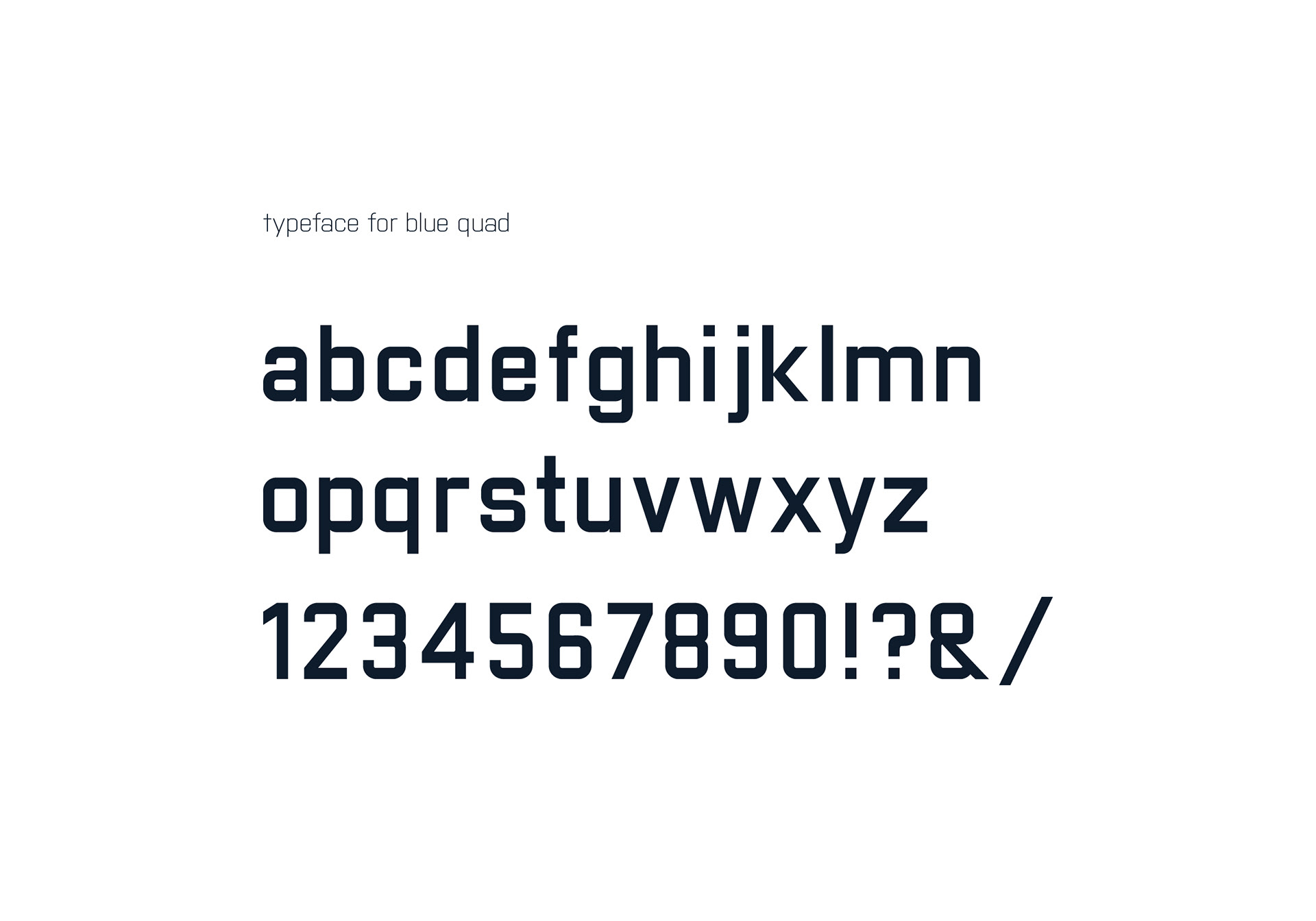
Including the blue containers and the land, is made up of squares, and we selected the word "quad" (quadrilateral, quadrilateral), a concise word that is easy to pronounce and remember, as it is suitable for this project. The original type face, inspired by the naming, is square in shape, but slightly rounded to express the casual and soft image of the interior design as well. The symbol mark uses only the word "quad" to emphasize the square, and the position of the square is variable according to the layout. The colors are navy blue, dark gray, and white as sub-colors extracted from architectural and interior design, and the above elements are also incorporated into the signage design.
Including the blue containers and the land, is made up of squares, and we selected the word "quad" (quadrilateral, quadrilateral), a concise word that is easy to pronounce and remember, as it is suitable for this project. The original type face, inspired by the naming, is square in shape, but slightly rounded to express the casual and soft image of the interior design as well. The symbol mark uses only the word "quad" to emphasize the square, and the position of the square is variable according to the layout. The colors are navy blue, dark gray, and white as sub-colors extracted from architectural and interior design, and the above elements are also incorporated into the signage design.
Credits:
Naming, graphic design and signage design: Kazuki Kaneko, one inc.
Creative direction and design direction: Ai Yoshida, etc inc.
Interior design: SUPPOSE DESIGN OFFICE
Interior design: SUPPOSE DESIGN OFFICE