sa vie
Brand identity / Graphic design / Wayfindin
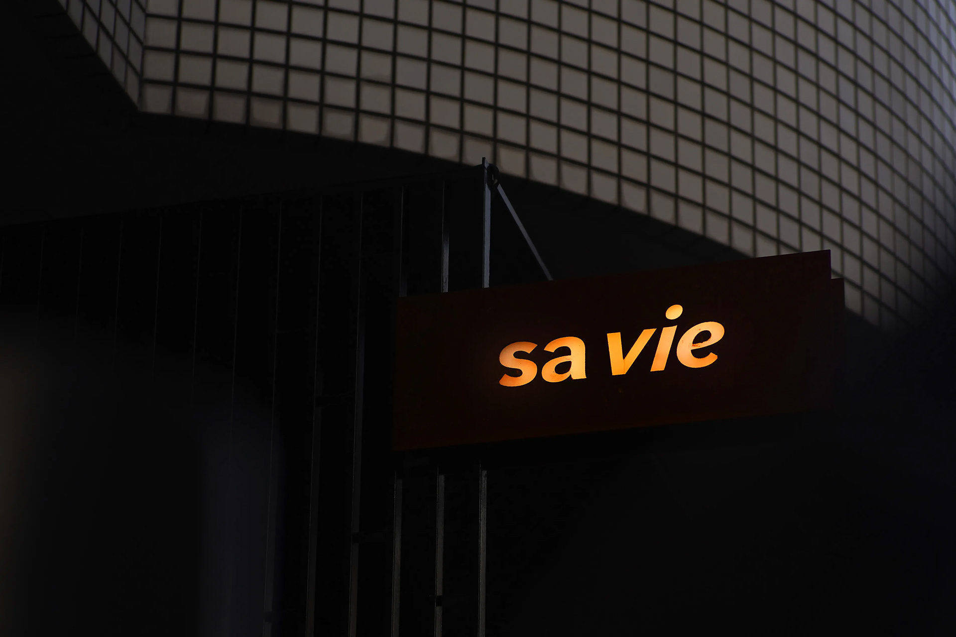
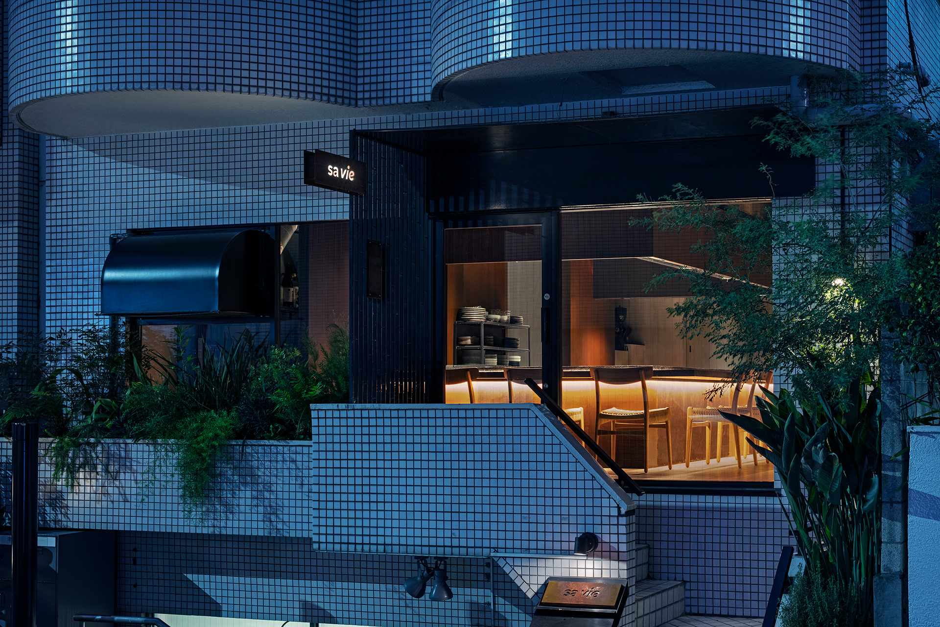
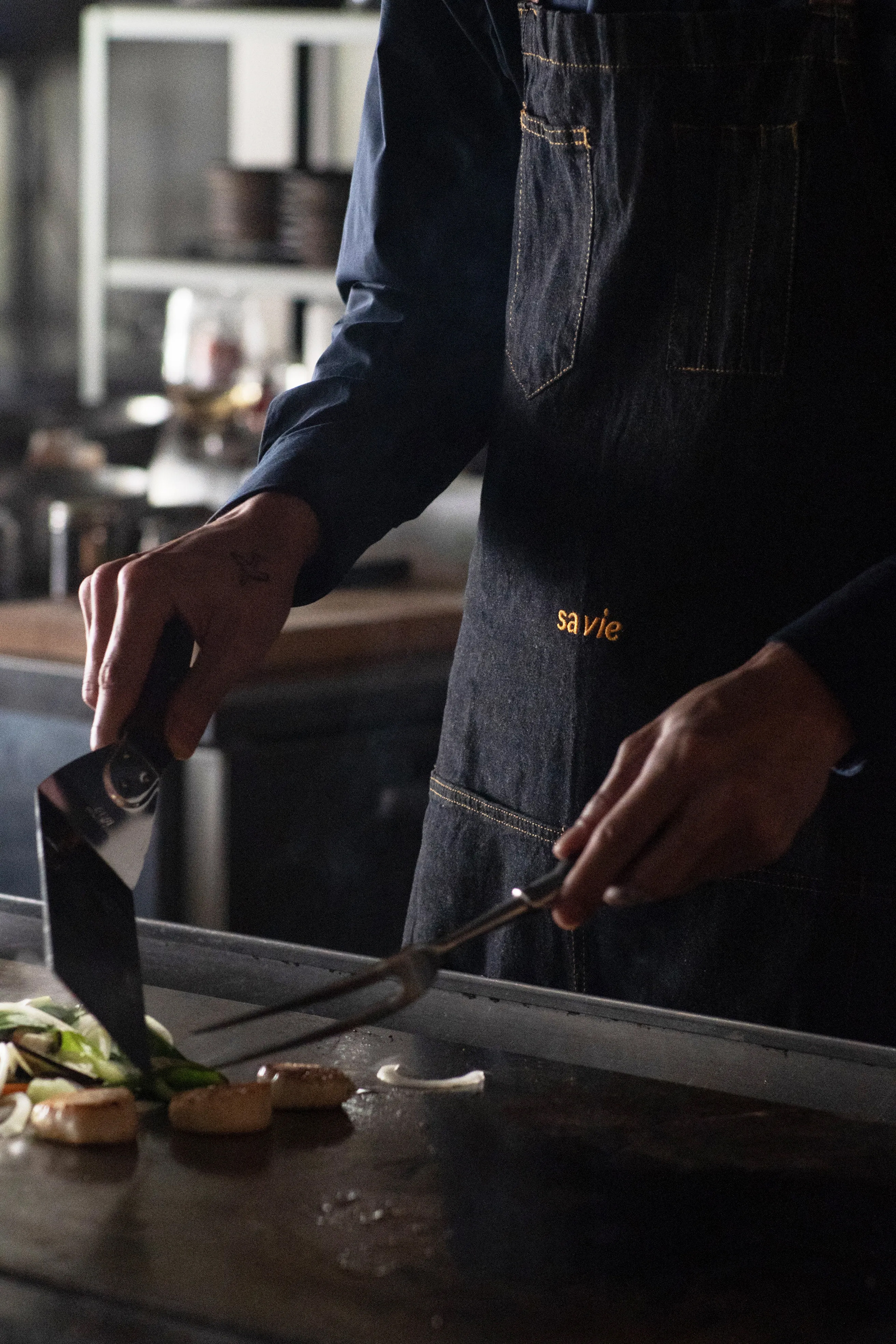
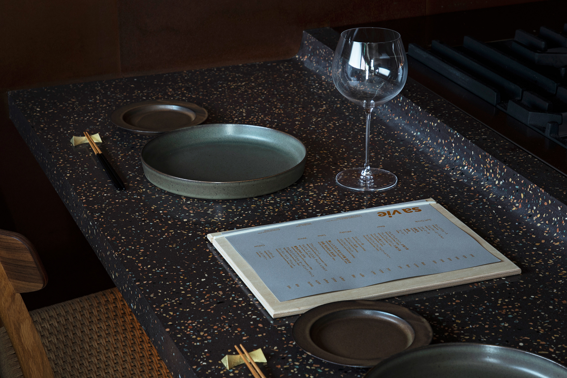
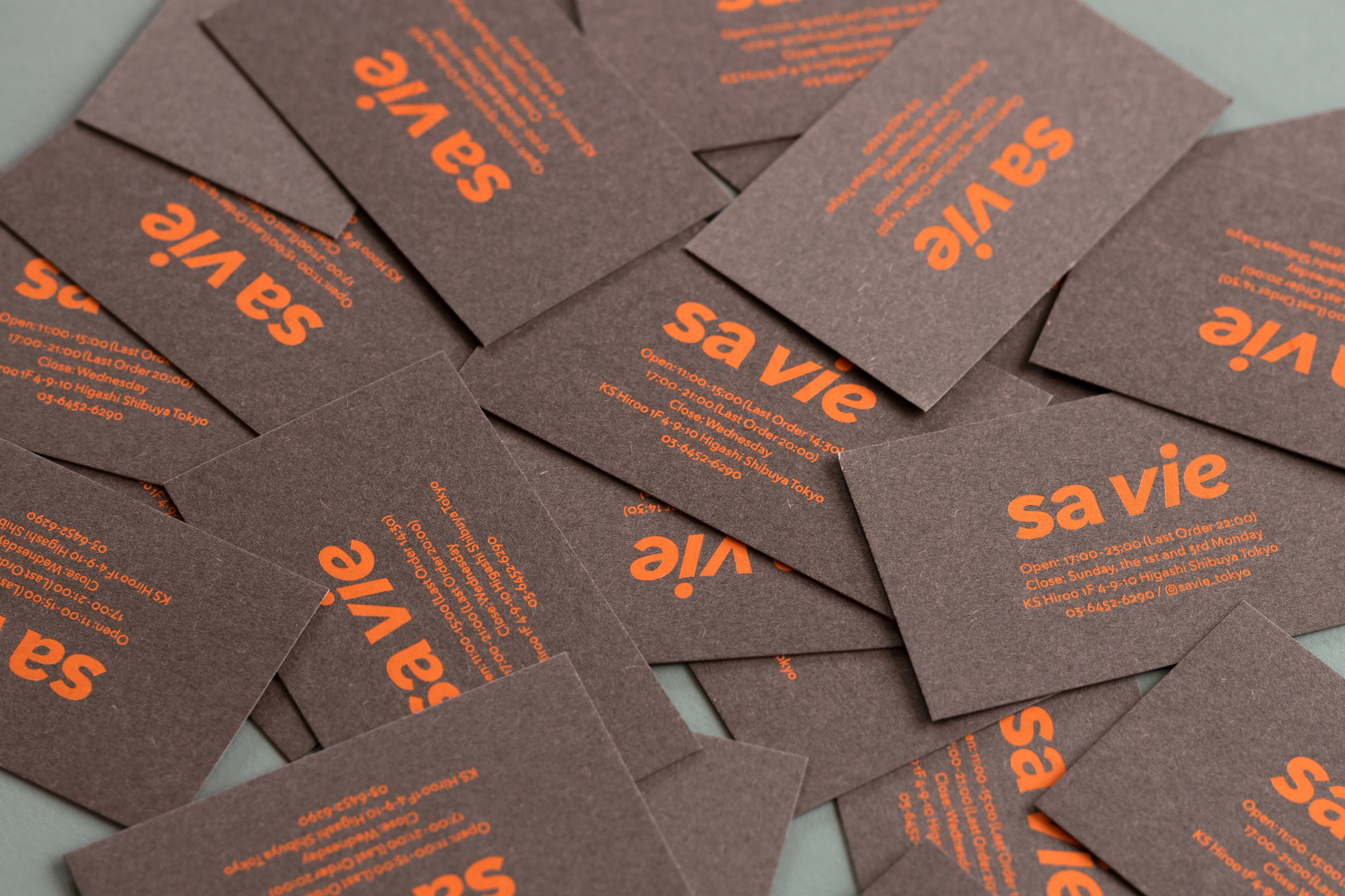
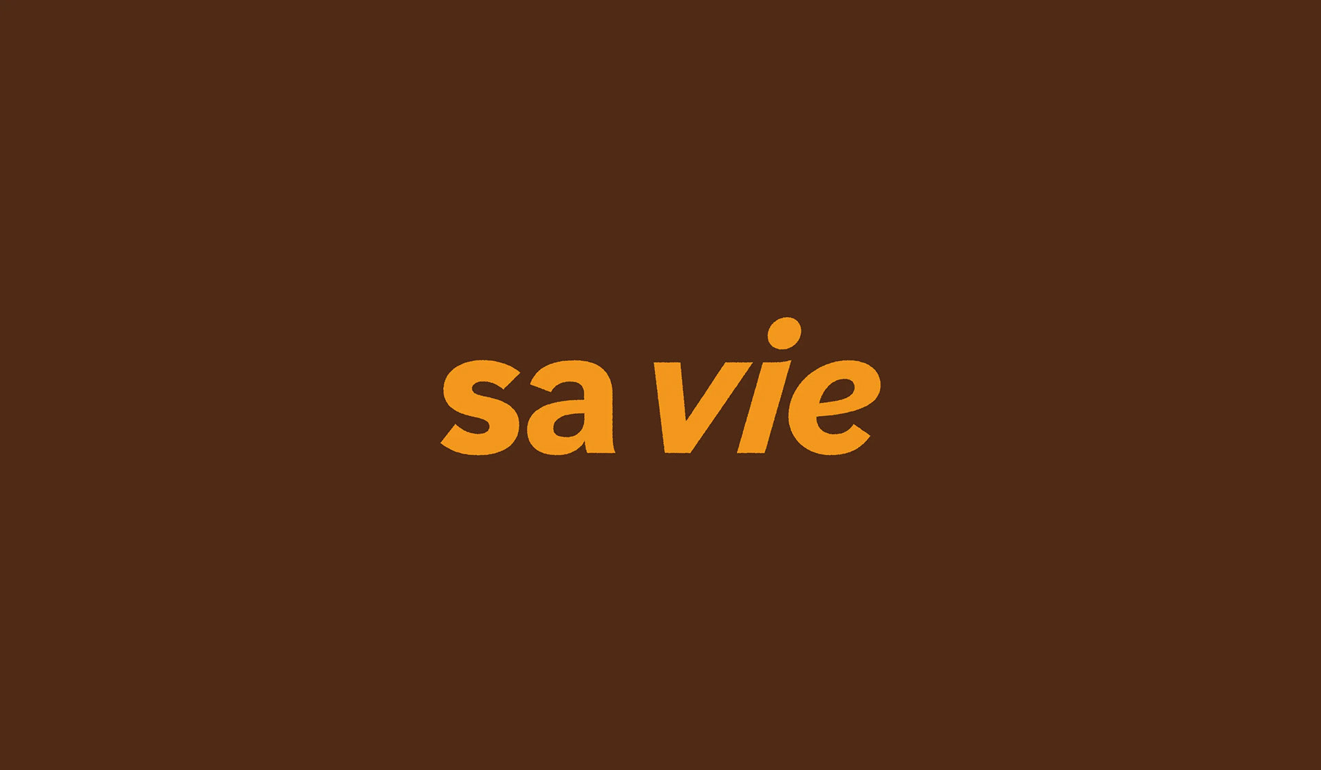
We were in charge of graphic design for a teppanyaki restaurant based on French cuisine in Hiroo, Shibuya-ku, Tokyo. The naming is derived from the French word "sa vie" (meaning "life"), which is the same sound as the key material for interior design, "Sabi" (meaning "rust" in Japanese). A visual identity was created that collectively embodies key words such as cuisine, the personalities of the chef and owner, interior design, French cuisine and "Teppanyaki". It is delicious and fun, at-home and playful, but also expresses a sincere approach and commitment to food and ingredients. As a gimmick, we rusted the edges a bit and attempted to link it with the interior. The brown of rust and the gray of mortar extracted from the interior were used as base colors, and the bright orange of lighting was selected as an accent color.
Credits:
Graphic design and signage design: Kazuki Kaneko, one inc.
Creative direction and design direction: Ai Yoshida, etc inc.
Interior design: SUPPOSE DESIGN OFFICE
Food produce: Satoshi Kakegawa
Interior design: SUPPOSE DESIGN OFFICE
Food produce: Satoshi Kakegawa